Home Colours: How to psychologically optimise your space
Our home colours have a significant impact on our emotions and behaviour, and incorporating the psychology of colours into the design of your home can create a comfortable and inviting atmosphere. From the cool blues that promote relaxation to the warm oranges that encourage social interaction, each color can affect our mood and perception. Here are some aspects of colour and how they can impact your home:
Mood Enhancement:
Colours have a significant effect on our moods and can stimulate different emotions. For example, blue is known for its calming effect, while red can promote energy and excitement. Colors can also affect our perceptions of temperature, making rooms feel warmer or cooler. Warm colours like yellow, orange, and red can make rooms feel cozier and intimate, while cool colours like blue and green can make rooms feel more open and airy.
Additionally, different shades of colors can also have varying effects on mood. For example, a soft pastel pink may evoke feelings of calmness and tenderness, while a bright and bold fuchsia may promote feelings of excitement and energy.
Furthermore, the use of color in art therapy has been found to be a powerful tool in enhancing mood and promoting emotional healing. By using specific colors, individuals can express and process emotions that they may not be able to put into words.
In conclusion, colors play a significant role in enhancing our moods and can have a powerful impact on our emotions and perceptions. Understanding the effects of different colors can help us create environments that promote positive feelings and enhance overall well-being.

Health and Wellbeing
The color of your walls, furniture, and decor can impact your physical and mental health. For example, studies have shown that blue and green colors can reduce stress and anxiety, promote relaxation, and lower blood pressure. On the other hand, yellow can increase feelings of anxiety and frustration in some people. Choosing colours that promote calmness and relaxation can help create a peaceful and healthy home environment.
Additionally, the colour of light can also impact our health and well-being. Exposure to natural light can help regulate our circadian rhythms, improve our sleep quality, and boost our mood. Artificial lighting, such as blue light emitted from electronic devices, can disrupt our sleep and negatively impact our overall health.
Color therapy, also known as chromotherapy, is a complementary therapy that uses colors to promote physical and emotional healing. It is believed that each color has a unique energy and vibration that can affect different parts of the body and promote healing. For example, red is believed to increase energy and circulation, while blue is thought to promote relaxation and calmness.
In conclusion, colours can impact our health and well-being in various ways. Choosing colors that promote relaxation and calmness can help create a healthy home environment, and exposure to natural light can have significant health benefits. Additionally, color therapy is a complementary therapy that uses colors to promote physical and emotional healing.

Room Function:
Different colours can also affect the function of a room. For example, warm colors like red and orange can stimulate the appetite, making them ideal for dining rooms and kitchens. Cool colors like blue and green, on the other hand, are better suited for bedrooms and bathrooms, where relaxation and serenity are desired. Bold and bright colors can add energy and vibrancy to a space, while softer, muted tones can create a more tranquil environment.
Additionally, the function of a room can also be affected by the amount of light in the space. Rooms with lots of natural light, such as those with large windows or skylights, can be ideal for workspaces or creative areas, as they can boost productivity and inspiration. Dimmer rooms with less natural light may be better suited for relaxation or sleeping areas.
The layout and furniture arrangement of a room can also affect its function. For example, an open layout with minimal furniture can make a small room feel more spacious and versatile, while a more traditional layout with defined areas for seating, work, and storage can make a larger room feel more functional and organized.
Overall, the function of a room is influenced by a variety of factors, including color, lighting, layout, and furniture arrangement. It is important to consider these elements when designing or decorating a space to ensure that it meets the needs and goals of the user.
Personal Style:
Color is an essential part of personal style and can reflect your personality and mood. If you prefer a modern and minimalistic style, neutral colours like white, grey, and beige can create a clean and sophisticated look. For those who prefer a more eclectic style, bold colours and patterns can create a unique and vibrant space. The colours you choose should reflect your personality and style, creating a space that feels uniquely yours.
Bold Colours for Statement-Making Look
Bold colors such as red, purple, and black can create a statement-making look, perfect for those who prefer a dramatic and bold personal style. These colors can evoke feelings of passion, confidence, and strength. Red is associated with energy and excitement, while purple is associated with luxury and creativity. Black is associated with elegance and sophistication, making it a popular choice for those who prefer a sleek and modern look.
Muted Colours for a Relaxed and Tranquil Feel
Muted colors such as blue, green, and gray can create a relaxed and tranquil feel, perfect for those who prefer a calm and soothing personal style. These colors can evoke feelings of peace, tranquility, and harmony. Blue is associated with calmness and serenity, while green is associated with balance and growth. Gray is associated with neutrality and sophistication, making it a popular choice for those who prefer a minimalist and modern look.
Neutral Colours for a Timeless and Classic Look
Neutral colours such as white, beige, and taupe can create a timeless and classic look, perfect for those who prefer a simple and understated personal style. These colours can evoke feelings of elegance, purity, and simplicity. White is associated with purity and cleanliness, while beige is associated with warmth and comfort. Taupe is associated with neutrality and sophistication, making it a popular choice for those who prefer a classic and timeless look.
Home colours:
Living Room

Your living room is typically the place where you entertain guests and spend time with your family. To create a warm and inviting atmosphere, consider using warm and welcoming colours such as beige, brown, or shades of orange. These colours can create a cozy and comfortable feel, perfect for relaxation and socialising.
Another great option is to use cool colors such as blue or green, which can create a calming and soothing atmosphere. These colors are perfect for promoting relaxation and reducing stress levels, which can be especially beneficial after a long day at work.
Your Study Room
Your study room is the place where you focus on work, study, and other activities that require concentration and focus. For this room, it’s best to use colors that can stimulate your mind and enhance your productivity.
Yellow is an excellent color for promoting creativity and increasing focus, making it a great choice for a study room. Blue and green can also be used in this room, as they can create a calming and soothing atmosphere that can help you concentrate and stay focused.
Your Bedroom

Your bedroom is the place where you go to relax and unwind after a long day. To create a peaceful and restful atmosphere, consider using cool and calming colors such as blue or green. These colors can help reduce stress levels and promote relaxation, which can lead to a better night’s sleep.
Another great option is to use warm and cozy colors such as beige, brown, or shades of orange. These colours can create a cozy and comfortable atmosphere, perfect for snuggling up and reading a book before bed.
In conclusion, the psychology of colours can play a significant role in creating a home that is comfortable, inviting, and healthy. Understanding the psychological impacts of different colours can help you choose the right colours for different rooms in your home. You can also consider incorporating the elements of Vastu Shastra along with your favourite colours into your home’s design, while paying attention to the impact these factors may have on your mood and emotions. By choosing the right colors, you can create a home that promotes relaxation, productivity, and overall well-being.
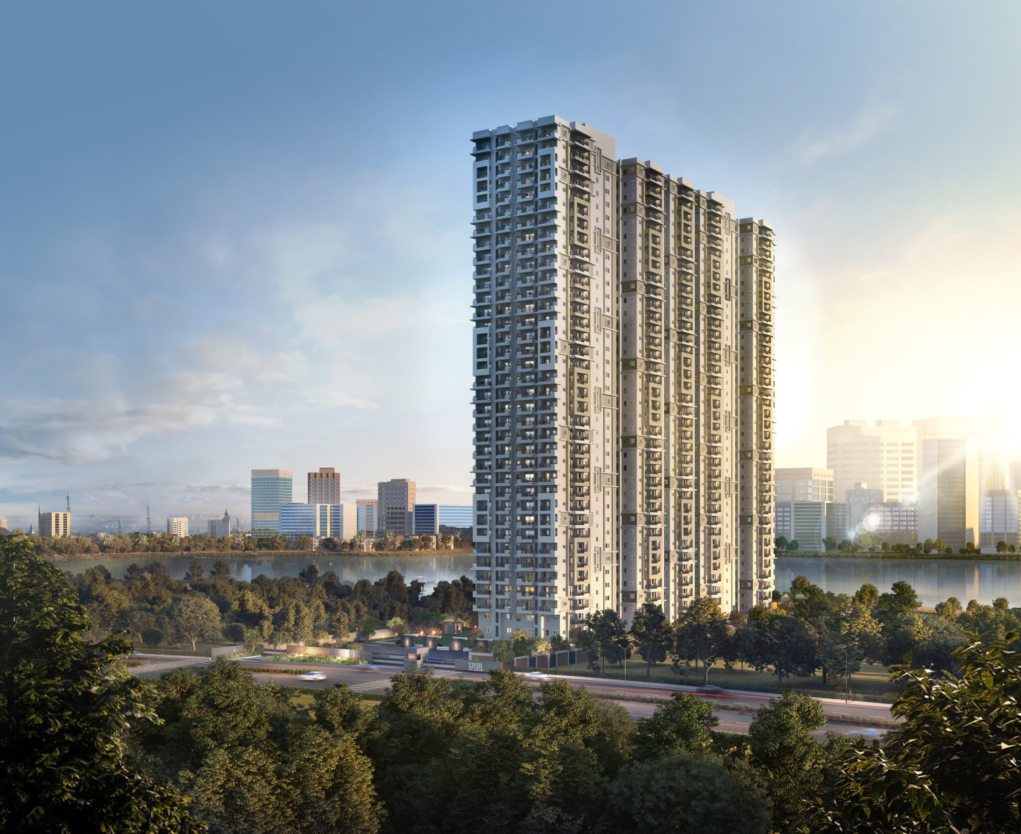
Check out ASBL Spire, ASBL Springs and ASBL Spectra
Consider using warm and welcoming colours such as beige, brown, or shades of orange. These colours can create a cozy and comfortable feel, perfect for relaxation and socialising.
Muted colors such as blue, green, and gray can create a relaxed and tranquil feel, perfect for those who prefer a calm and soothing personal style. These colors can evoke feelings of peace, tranquility, and harmony. Blue is associated with calmness and serenity, while green is associated with balance and growth.
Own Your Dream Now! 3 BHKs in Kokapet | Ready to move | Premium Lake Facing Apartments

Live Where You Work | Spacious 3 BHKs in the Heart of the Financial District | From ₹2.25 Cr .

Exclusive 3BHKs | Experience the city’s rhythm in Financial District | Starting at 2.5 Crs
Our Projects
Own Your Dream Now! 3 BHKs in Kokapet | Ready to move | Premium Lake Facing Apartments
Live Where You Work | Spacious 3 BHKs in the Heart of the Financial District | From ₹2.25 Cr .
Exclusive 3BHKs | Experience the city’s rhythm in Financial District | Starting at 2.5 Crs
Latest Articles
-
Apartment Interior Design: Unlocking Mental Well-Being Now
-
Buying A New House? Don’t Fall For FOMO’s Traps!
-
Hyderabad Real Estate Market: Is Your Investment Property a Winner?

-
Financial District Hyderabad: IT Corridors Fuel Housing Demand

Related to this Article
-
Union Budget 2026: Will Rail Expansion Boost Hyderabad Real Estate?

-
How to File a TDR in Telangana: A Clear Guide for Property Owners

-
TDR Policy in Telangana: Why Hyderabad Homebuyers Should Act Early

-
Residential zoning laws in Hyderabad: Everything You Need to Know Before Buying Property